Friday, October 31, 2014

Something Familiar


I wanted to do this idea for a New Yorker cover for years and never got around to it until now.  As it happens, my "Hip Hops" piece (from the previous post) was accepted as the cover of the Food Issue which unfortunately was scheduled to appear the only week this one could have run. In other words, I bumped my own cover.
Timing is--
everythi

ng     .

Monday, October 27, 2014

Hip Hops


It seems that all my New Yorker ideas these days have to do with my neighborhood here in Brooklyn. Here's a piece inspired by one of my favorite beer joints.

Cheers!

Monday, June 2, 2014

Icons of Animation!


Don't blame me for the title, it was Bill Plympton's idea! But then again, so was the show itself, which was a pretty good idea. Opening this week at the Society of Illustrators of New York, will be a four-man show called Icons of Animation which will feature the work of the indefatigable Bill Plympton, the dazzling Carlos Nine, the fantastical William Joyce and, um, me. I haven't seen it yet but I can't wait. On view will be over one hundred pieces of original works on paper for projects varying from the highly personal to the shamelessly commercial. Please join us (Bill and me at least; Joyce and Nine couldn't make the journey because of other commitments) for the opening reception this Friday evening.
Details here!
And if that's not enough for you, this Thursday night, Bill and I will sit on a panel together discussing our experiences in the field of animation which will be moderated by my old pal, J.J. Sedelmaier.
The event is sponsored by the Academy of Motion Pictures and will take place at The Academy Theater at Lighthouse Guild.
Details HERE!

Monday, March 31, 2014

A New Leaf

This week's cover is somewhat autobiographical.  I tried for seven years to be a vegetarian but just couldn't resist the call of the wild. I wish I could because I really love animals. 
Unfortunately, they're delicious.

Tuesday, March 11, 2014

Subway Lines

I know I've said this before, but for inspiration one doesn't have to go very far, especially in New York City. One short hop on the Lexington Ave. line is a crash course in character and costume design. 

The last two sketches were made in a cafe during a recent trip to Paris. 
Ok, some times you do have to go far.


Tuesday, January 21, 2014

"Just a Pinch"


This cover came out yesterday and my first reaction was embarrassment; it was unseasonably warm and there wasn't a cloud in the sky.  I'm delighted to report that as I write this, the snow is coming down by the pound.

Thursday, October 31, 2013

A one day workshop in Paris!


I'll be teaching a one day workshop in character design for anyone who might happen to be in Paris on November 12th. The class will be sponsored by France's most prominent movie magazine, Le Film Francais and will include a lecture and short assignment which we will review in class. You can find more details about the workshop here.
Believe it or not, aside from my class, there is another reason to go to Paris.  After long last, my dear friends Diane and Jean-Jacques Launier will finally celebrate the opening of their new museum, Art Ludik,  which will be dedicated to showcasing work done for the entertainment arts, especially in  animation. Amazingly, their very first exhibition will be The Art of Pixar which is an updated version of the colossal event that premiered at the Museum of Modern Art back in 2006. I can't wait to raise a glass to Diane and JJ and to their own colossal achievement.

Monday, October 21, 2013


I began this picture thinking it would be such a breeze and yet somehow it still turned into a fight to the death. After four failed attempts, each one almost finished, I was in complete and utter despair and ready to give up. Luckily, Randall courageously dared to come down to the studio to see what all the wailing and smashing of furniture was about and calmly pulled this version out of the trash. "You can save this one. Really. I'm not just saying it." With no hope left and nothing to lose, I dove in again, oddly liberated by the thought that I would be no worse off than before she came downstairs.
I've been learning this lesson over and over again since the first time I picked up a pencil-- to throw caution to the wind and trust that it will work out. Easier said than done. But after all that struggle and some help from my lovely wife, I have to admit, I kind of like this piece.
It's not the one I pictured, but really, how often does that happen anyway?


Tuesday, June 4, 2013

I've been trying to climb out of a little drawing rut I've been in lately and convinced myself to go to Sketch Night at the NY Society of Illustrators this evening. I was talking to a writer friend of mine afterwards and she commiserated with me on the need to shake things up a bit every now and then.  Drawing from the imagination is not the same as drawing from life and writing book reviews is not the same as writing a short story. But the critical thinking needed to write a book review can help inform a work of fiction, the same way drawing a real person can help you better depict one who is wholly invented.
I am not saying that one night of drawing the figure repaired things for me entirely, but it was refreshing to use a different part of the brain again-- the one that observes rather than the one that imagines. Both are so crucial in this line of work, but it is easy to forgo one for the other, leaving that neglected part of the brain to dry up a little. So here is a single drawing out of only three or four I did tonight that may or may not represent a light at the end of the tunnel.


PS: Sometimes the best models are the ones who aren't posing.


Monday, June 3, 2013

Peter Clarke


 My pal, Peter Clarke, is not one of the most talkative guys you’ll ever meet. In fact, when I first met him in the earliest days of the very first Ice Age movie, I got the distinct impression that he would much rather be left alone to do his work than stand around jawing with the likes of me. Well, it soon became clear to me and to everyone else at Blue Sky Studios, that there was a lot going on beneath those still waters. And now, with a massive show in Los Angeles, we can all get to see how very deep those waters run.
   Clarke is what is known in the industry as a “world-builder”; the person a director goes to when he/she wants to finally see the universe in which their story will take place. This happens soon after a script has begun taking shape and will often inform where the story and the “look” of the entire production will eventually go. Clarke has an astonishingly intuitive grasp of perspective and can bend it to whatever suits his purpose. Whether depicting ancient undersea caverns or multi leveled futuristic societies, he makes the impossible utterly convincing. His style is very much his own with one foot planted firmly in the real world and the other in a gnarled, cubist bizarroland. Both his environments and the characters that dwell in them for that matter, are made of simultaneously twisting and chiseled forms that despite their seeming elasticity, are still somehow totally plausible. If you were to look at any frame of the first Ice Age movie without the characters, you would know exactly who designed that world. Imagine being given the assignment to create a fascinating and varied landscape comprised of only ice and sky. Peter embraced the limitations and made a barren landscape his playground with the result being one of the most unique I’ve seen in an animated film. 
  But that was only the tip of the iceberg (ahem) and this sprawling retrospective covering his work in feature films, video games and personal work, will take you to many other worlds, including forgotten civilizations and ones that have yet to be built.
Peter Clarke's show, Past, Pencil and Future, is the inaugural exhibit of Center Stage Gallery in Burbank, California and is a joint effort by CTN (Creative Talent Network), Stuart Ng Books and Wacom.
The show opens on June 6th and will run until June 30th.
For more info, go here.


The Two Petes, back in the Ice Age (circa 2000).
photo by Irka Seng

Monday, April 22, 2013

Randall's got a new book!


As you may recall, my wife, Randall de Sève, has written a few children's books, including our one collaboration, The Duchess of Whimsy. Above is an announcement for a pub party to celebrate her latest, Peanut and Fifi have a Ball,  to be held at the greatest children's books store on the planet, Books of Wonder. The book is charmingly illustrated by Paul Schmid who has quite a few books under his belt himself.
If you'd like a signed copy or just want to say hello, we'll see you this Thursday!


Monday, February 11, 2013

The Delaware Art Museum


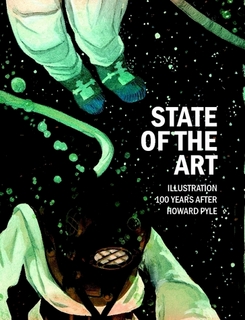
catalogue cover by Sterling Hundley


Crayon drawing of Scrat which appears in the exhibit.


I am taking part in what sounds like a terrific show at the Delaware Art Museum called State of the Art, Illustration 100 Years after Howard Pyle. I say it sounds terrific because I haven't actually seen it yet, due to the blizzard named Nemo (thank you, Pixar) which slammed the northeast on the night of the opening. The show is described below by, David Apatoff, the curator of the exhibit and a collector and connoisseur of Illustration, past and present.

In the century following Pyle’s 1911 death, American illustration has diversified into a creative empire that includes a wide range of exciting art forms. From animated feature movies and computer images to graphic novels and conceptual art, America’s storytelling artists use the latest technologies and the newest media to tell an ever-richer blend of stories to ever-broader audiences. 
For this exciting contemporary exhibition, Guest Curator David Apatoff, illustration scholar and author of biographies on Robert Fawcett and Albert Dorne, highlights the following eight artists: story illustrator Bernie Fuchs; graphic designer Milton Glaser; MADcaricaturist and comic artist Mort Drucker; The New Yorker cover artist and character designer for animated films, Peter de Sève; editorial artist John Cuneo; painter and book artist Phil Hale; painter and magazine illustrator Sterling Hundley; and Pixar production designer Ralph Eggleston.

Saturday, February 9, 2013

Blah! Blah! Blah! by Ward Kimball

  The image below was sent to me recently by an old high school pal of mine, Robert Arkus ,who found it on Facebook and thought I might find it interesting. Not only did I find it interesting but despite the fact that it was written years ago to someone else entirely, it spoke very directly to me and I suspect it will to many of you fellow visual artists as well.
  I hope it won't seem too egotistical to say that I get a fair amount of correspondence from artists, young and sometimes not so young, who struggle with their work and come to me for advice. The queries, while flattering can also be exhausting to answer. Questions like, "If you have a few minutes, could you give me some secrets on how to become a successful illustrator?"or "I really love character design, can you tell me the quickest way to do that?" are virtually impossible to answer. While I truly do understand the desire for tips and shortcuts and secret recipes, they simply don't exist. And though I have struggled to answer many a letter like this, there are many more that I simply didn't have the time for. Below is a typewritten note (written on a typewriter!)  by the great Ward Kimball, legendary Disney animator, to an aspiring young animator named Will Finn. It is the perfect, no-nonsense reply to anyone seeking advice,  inspiration and a well needed kick in the ass. The fact that it was written forty years ago does not diminish it's message to us in the least. Every line of it is the honest unvarnished truth about becoming an animator or illustrator and to some extent, a well rounded human being. For me it is a welcome splash in the face with a cold bucket of reality.  A reminder that success in what you do doesn't just happen to you.
You make it happen.


And in case you were wondering, Will Finn, the recipient of this letter, went on to become a great Disney animator himself.


Monday, July 16, 2012

A decade has now passed since I did my very first designs for the Ice Age franchise. And though the series is perhaps a little gray around the tusks, it shows no real signs of slowing down--at least according to the Almighty Box Office. Ice Age, Continental Drift is apparently breaking all kinds of records overseas and isn't exactly tanking at home either. And yes, I have my quibbles with the final result but I won't use my space here to delve into them. The little ones seem to be enjoying the film anyway, so who am I to argue?


Instead, now that the movie is finally released, I would like to share some of the drawings I did this time out. As usual, Blue Sky Studios has delivered a gorgeous movie, and I am once again honored to have worked alongside so many amazingly talented people in order to get these characters up on the screen. 


The Sirens.
                                       
Silas, a salty petrel.

Sid's Granny.


Dobson, like a few other characters I designed for this film, ended up having a non speaking part.

A hyrax learns how not to ride an eohippus (who is not in the film).


The squid didn't make the cut either.

Nope. No horses.


Squint, a nasty looking bunny pirate, was originally written as the pirate captain and leader of our villains.


It was fun to finally figure out what Sid's Uncle Fungus actually looked like. He was referred to only once in the history of the franchise. In fact, it was in Sid's very first scene.

Granny takes a bath, oblivious to the prehistoric sharks who also, by the way, did not make it into the film either.


Captain Gutt was originally written as a bear, but frankly,  I could never  nail him down in a drawing.  Somehow,  I just got the feeling that ursine was not the way to go.
It was only when I stumbled on the idea of making him an orangutan that things started to flow. What creature could be more at home swinging from the rigging? I think the animators were very relieved to have a character they could really have fun with and one who wasn't simply a biped. After all, an ape has four hands to work with.

Louis, the mole hog in love with Manny's teenage daughter,  Peaches.

A siren from the films creepiest sequence. Boy, lighting and materials did an incredible job on these guys!

And of course, there is Scrat. Always the survivor.


As requested, a few more Gutts.

These first two are early versions.

This one and the next are closer to the finished design.


Tuesday, May 8, 2012

Shameless Self Promotion, Part 73


The New Yorker has apparently sent out a little email blast with a link to a page spotlighting my work and  providing an opportunity to purchase prints of many ( but apparently not all) of my covers. So why not post it HERE, too?